Showing posts with label informational. Show all posts

Friday, July 25, 2014

YOU WOULDN'T WANT TO BE SIR ISAAC NEWTON!: A Lonely Life You'd Rather Not Lead, by Ian Graham

Quick Facts:
- illustrated by David Antram
- part of series (You Wouldn't Want to Be . . .)
- 32 pages
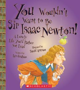
"You Wouldn't Want to Be Sir Isaac Newton!: A Lonely Life You'd Rather Not Lead" is part of a series of informational books for children, all of which utilize the device (and titular structure): You Wouldn't Want to Be . . . 

Overall, this is a fun, informational book with a structure entertaining and accessible to children. Simple sentence structure, amusing illustrations, and careful page layout make it developmentally a very appropriate text for mid to upper-elementary students. It includes a table of contents, glossary and index, which makes more easily navigable.

The illustrations lend a great deal of humor and accessibility to the test, while also supporting the information presented in the text:


Though the cartoon is funny, it also reflects the information immediately preceding it: that Isaac Newton's father died before his birth and so he had only his mother, and that he was raised in a manor house. The layout of multiple picture with accompanying text keeps the reader engaged while also moving the story along chronologically:


You'll note that the events depicted move chronologically from top to bottom, through the early years of Isaac Newton's childhood. 

I do, however, have one major reservation about this book. The "You Wouldn't Want to Be . . . " series covers everything from more general subjects (like "You Wouldn't Want to Be A Pirate's Prisoner: Horrible Things You'd Rather Not Know") to specific biographies, like this one on Isaac Newton. The signature device of the series is that they directly address the reader to inform on the lesser-known, often grosser and more outrageous facts of a given topic. This works very well for subjects like pirates, where the "gross-out" factor is actually kind of fascinating, and makes the book a funnier read. With biographies, however, this device words less well.

In this biography of Isaac Newton, the outrageous facts highlighted are things like the personal tragedy of his upbringing (no father, and a mother that abandoned him at a young age) and his individual demons (like battling depression). These do not have a humorous effect, though they certainly support the titular statement. Consider the following:

"YOU ARE a remarkable person, but you have trouble getting along with other people. your obsessions quarrels, and secrets make you lonely and unhappy."
- "You Wouldn't Want to Be Sir Isaac Newton!: A Lonely Life You'd Rather Not Lead", page 5

I take issue with information presented like this. It's one thing to present factually the ups and downs of Newton's life. It's another to spend the book reinforcing the title: "A Lonely Life You'd Rather Not Lead". This suggest that the hardships and lows in Newton's life were not worth the successes. This is a very dangerous message to send to children, who are the book's target audience. Greatness in any field requires hard work and sacrifice, but that does not mean that we should not strive for it.

Wednesday, July 23, 2014

DARK EMPEROR & OTHER POEMS OF THE NIGHT, by Joyce Sidman

Quick Facts:
- illustrated by Rick Allen
- poetry
- collection
- Newbery Honor Book

"Dark Emperor & Other Poems of the Night" is a collection of poems linked by the theme of what happens in nature after the sun goes down. The poems are organized in a natural progression, beginning (appropriately) with "Welcome to the Night" and ending with "Moon's Lament", which reflects the moons feelings about the coming dawn.

Despite their strong thematic link, each poem is distinct and self-contained enough to be enjoyed on its own. The effect of this is that the poems complement one another, rather than relying on one another. You can enjoy "Night-Spider's Advice", for example, completely on it's own. But you see it in a different light once you've read "Cricket Speaks", simply for the way in which you can imagine these two perspectives might be at sometimes fatal odds.

One of the most interesting choices author Joyce Sidman makes is to include an informational blurb with each poem, printed on the page opposite the poem. This information actually serves to support and deepen the reader's understanding of the poem, while also providing a teaching moment about nature. For example, on page 8 the poem "Snail at Moonrise" refers to a snail as "shell-maker". The informational blurb on page 9 then elaborates on this, telling the reader that young snails produce a special material that helps them add layers to their shells as they grow. By focusing the informational blurb to what is relevant to the poem, Sidman not only provides support for understanding her poems, but encourages the reader to be active in their reading of her poetry.

"Dark Emperor & Other Poems of the Night" contains many different poetry styles, each poem playing with rhyme, rhythm and sounds in different ways. For example, consider this portion of one of my favorite poems, "Ballad of the Wandering Eft":

"Come all you young efts,
so brave and so bold,
and don the bright colors
of scarlet and gold.

Step out from your puddles
to breathe the sweet air
and wander the woodlands
with hardly a care.

     For it's wild and it's windy
    way out in the woods,
    where the moss grows like candy
    and the hunting is good,
    where the rain falls from heaven
       and mud's underfoot
    It's wild and it's windy
    way out in the woods.
- "Dark Emperor & Other Poems of the Night", page 24

As is typical with ballads, it has a repeating verse (the italicized one), and uses consistent syllable patterns and rhyme to create a rhythmic flow to the poem. The poem is structured symmetrically: verse, verse, chorus, verse, verse, chorus.

Now consider "Dark Emperor". Along with having no rhyming pattern or syllabic consistency, "Dark Emperor" plays with words in a wholly different way:


The poem looks like an owl! The final verse, which references a "tiny hiccup" when considering the owl's predatory prowess looks (in contrast and placement) like a small animal about to become the owl's prey. This diversity in poetic style and structure makes "Dark Emperor & Other Poems of the Night" an excellent introduction for students to the variety of forms poetry assumes.

Finally, Rick Allen's woodcut illustrations are appropriate and support the poems not only by highlighting both the grit and beauty of nature, but by using the play of darkness against light in a way suggestive of the moon glinting through leaves:


These images support the sense that the poems give the reader of glimpsing into a familiar and yet unknown world, the effect of the woodcut style and the play with light rendering familiar images more complex then we are used to seeing them.

Thursday, July 17, 2014

THE BEST BOOK OF BUGS, by Claire Llewellyn

Quick Facts:
- 32 pages
- nonfiction

The Best Book of Bugs is a bold title for author (and illustrator?*) Claire Llewellyn to have chosen, especially since there are an abundance of picture books about bugs for children. However, while I lack the bug-book background for wide comparison, I can confirm that this is a truly excellent book about bugs, describing the habits, habitats and life cycles of a variety of insects.

Information about bugs aside, perhaps one of the best things that The Best Book of Bugs does is help develop a young reader's pragmatic awareness of how traditional informational texts are arranged. The book begins with a table of contents where the reader can determine the location of each topic discussed in the book. This table of contents includes illustrations to accompany the text, so that even emerging readers can determine (for example) that bees are discussed on pages 12 and 14:


The pages are numbered along their bottom outside corner, and each section is labeled (in font larger and bolder than that found on the rest of the page) identically to the way it was named in the table of contents. Pages 32-33 at the very end of the book contain a glossary of terms used throughout the book. That said, glossary terms are not bolded throughout the book, which means that in terms of full functionality as an information text, The Best Book of Bugs is better suited to readers with a bit of familiarity already with how a glossary works.

In terms of the information and page-layout, The Best Book of Bugs does not waste any space, while still maintaining readability and flow. Consider the following page:


There is a lot going on here, but it is carefully organized. Each bug shown is clearly labeled, with lines connecting label information to specific parts of the bug. For the two illustrations which have a more substantial amount of text accompanying them (the central, cross-page stream and the Damselfly Nymph), a small triangular bullet precedes the text, pointing in the direction of its accompanying illustration. Bookending the central information are panels showing information on two clearly labeled topics. Along the far left edge, moving down the page, are outlined the steps a dragonfly nymph follows to catch a meal. Along the far right edge, moving down the page, are three examples of how different water bugs obtain oxygen. This structure allows a great deal of information to be shared in a way that is simple for the reader to navigate and digest.

The illustrations accompanying the text in this book are wholly realistic, which is appropriate both for an informational text and also for the detail with which the text at times discusses its subject matter. Take, for example, the following section on the "stag beetle":


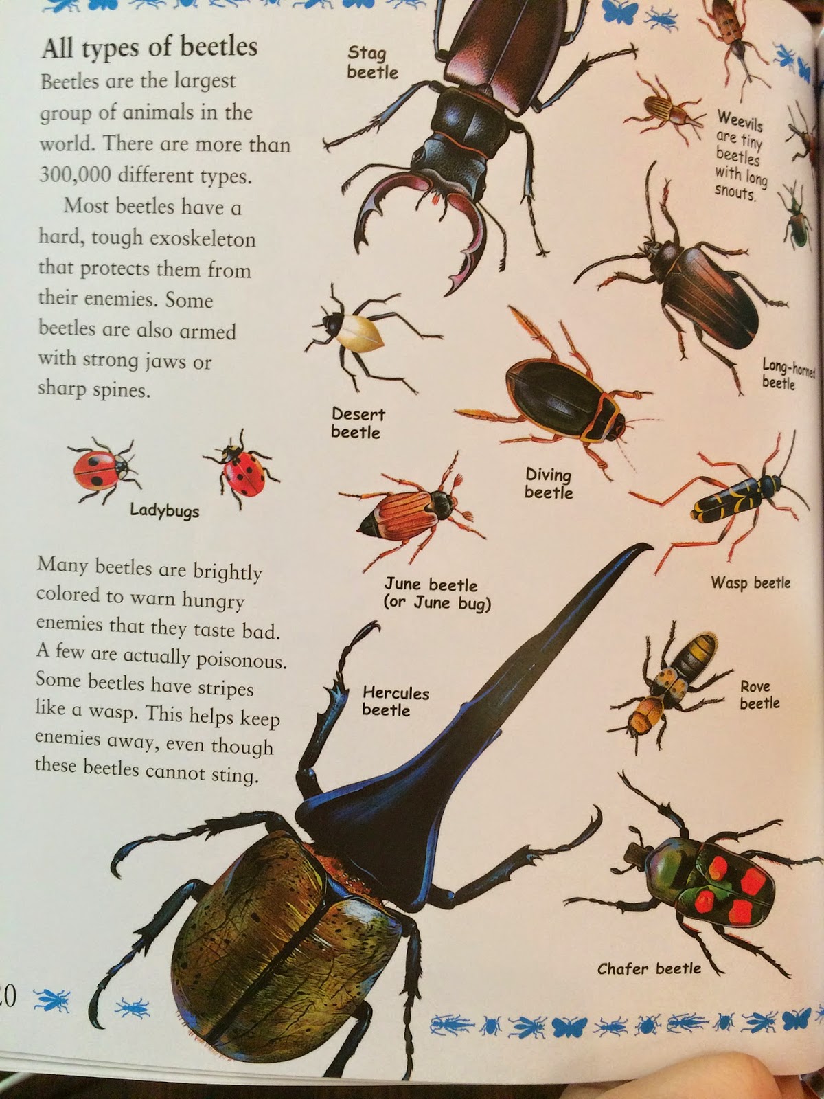
A more impressionistic illustration, focusing primarily on shape and color (like those in Planting a Rainbow) would not permit the reader to see the way in which the stag beetle's jaws look like "horns or antlers." What's more, it would provide little basis of comparison for the reader to distinguish the differences between the different types of beetles shown later:


Overall, The Best Book of Bugs is a very informative, easily navigated book about bugs for young readers. Because of the size of it's type (average is about size 12 font), the scientific language used ("nymph", "oxygen", etc.), and the lack of bolded glossary words, I would recommend it for ages 8+. 

Also, for readers interested in bugs. You have to really like bugs.

*This seems implied by the bibliographic information, but is not explicitly stated. 

PLANTING A RAINBOW, by Lois Ehlert

Quick Facts:
- picturebook
- 40 pages
- Written and Illustrated by Lois Ehlert

This book is an excellent introduction for young children to the process and steps involved in growing a garden, as well as to a variety of colorful plant species. The story is simple, and established in the very first line:

"Every year Mom and I plant a rainbow"
- Planting a Rainbow, page 1

Note that the colors used in the text for "rainbow" are the colors of the rainbow, in backwards order than children will later learn them in school (ROY G BIV, anyone?) This simple and yet careful attention to detail is characteristic of the book as a whole.

Both the language and illustrations Ehlert uses are developmentally appropriate for beginning readers and young children (not always the same thing!) Though she uses vocabulary specific to her topic of gardening (e.g. bulb, seedlings, sprout, soil), her sentence structure remains very basic:

"In the fall we buy some bulbs and plant them in the ground."
- Planting a Rainbow, page 2-3

You'll notice that in both quotes I've used, I've made the text larger. This is to reflect Ehlert's use of large, easy-to-read font, which not only lends itself to the aesthetic of the book, but makes it easier for little hands to point as they read.

Her accompanying illustrations reflect the accurate and yet easy-to-read nature of her prose. Rather than including incredibly detailed pictures of the plants she describes, Ehlert elects to show instead the general impression the flower (or bulb) makes, focusing on shape and color as her means of communicating this. For example, observe the five different bulbs and flowers shown in the illustration below:


Each bulb and flower is unique, reflecting through shape and color the overall effect of the flower. Furthermore, each labeled species is accurately depicted, distinct from the ones surrounding it. Compare, for example, the below images of a daffodil and its bulbs to the center illustration of a daffodil above.

Daffodil (Narcissus)
Daffodil (Narcissus) Bulbs

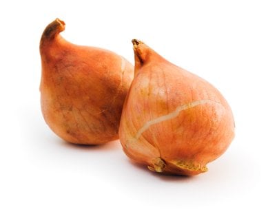
Ehlert has depicted daffodils accurately in shape and color, down to the darker yellow/orange center and the bulbs that are larger, and grayish in contrast to the red/orange of a tulip bulb and the purple of a hyacinth bulb (see the below image of tulip and hyacinth bulbs for proof of this contrast).
Tulip Bulbs

Hyacinth Bulbs
Childrens' ability to perceive the details that distinguish objects develops as they grow older. A very young child, for example, might perceive only that these are all flowers because they have basic characteristics the child associates with flowers: growing out of the ground, a stem, a colorful head. Thus, Ehlert's focus on the overall effect of the flower, rather than on more realistic detail, is appropriate for very young readers who are still develop their ability to classify objects. Though they are both flowers, Ehlert's illustrations make it easy to tell (for example) that the daffodil is differs from the tulip in color and shape, both of which are characteristics children can use for object classification early in their development.

On the topic of color, Ehlert ends her book with a call back to the rainbow of the very first page. Once the flowers have all bloomed, she takes her readers through each of the species, organized by color, and in order of the light spectrum:


Each color marks the edge of a page, which is identical to the one showing in structure. The flowers shown on each page reflect the color shown on the right side of the page. This not only aids children in developing their color classification, but subtly reinforces the spectrum colors, and the order in which they appear.

Planting a Rainbow is a beautiful and informational book for readers of all ages, but it is designed to be particularly appropriate for the development of very young children and readers.

THE BIRD ALPHABET BOOK, by Jerry Pallotta and Edgar Stewart

Quick Facts:
- Illustrated by Edgar Stewart
- alphabet picture book
- 32 pages


The Bird Alphabet Book, written by Jerry Pallotta and illustrated by Edgar Stewart, is a beautifully illustrated alphabet book that introduces the reader to twenty-six different species of bird (plus one bonus mammal!) The book does a lovely job of presenting specific information about each of the species that is likely to engage young readers, and which anticipates their questions about each bird.

Consider, for example, the following page for "T":


As an informational book, Pallotta is bound to provide factual information on the birds he chooses to represent each letter. However, it is clear that he put a good deal of thought not only into which birds would be the most visually interesting for young readers, but which ones were likely to inspire childrens' questions. By choosing a toucan to represent the letter "T", Pallotta not only selected a bird that is unique and interesting to the eye, but that looks a little goofy. You can imagine a child giggling and pointing to the long orange beak, asking, "But why the beak so long?"

This is where the collaboration between author and illustrator becomes clear. Rather than explain that the toucan's beak helps it reach food deep inside tree holes, Pallotta allows this information to be shown by Stewart's illustration. This leaves Pallotta free to address the next likely question: but isn't the beak heavy? One of the frustrating aspects of informational books for both parents and children can be when the book doesn't have information to answer the questions children have. Though The Bird Alphabet Book certainly doesn't answer all questions, it does endeavor to anticipate and respond to as many of them as possible.

Perhaps one of the best moments of anticipating the readers' questions occurs at the very beginning of the book, with the letter "B":

The text here reads:

"B is for Bat. Hey, wait a second! Bats are not birds. Bats are mammals Even though they have wings and they can fly, they do not have feathers. Get out of this book, you Bats!

Now that the Bats are gone, let's find a bird whose name begins with the letter B."
-The Bird Alphabet Book, page 2-3

Bats, by virtue of the place they hold in popular culture as a symbol of the night (and also the way their name rhymes with "cat" and "mat" and "sat"!), are some of the first animals with which children often become aware- even if they've never seen one in real life! The bird that Pallotta chooses for "B" is the blue-footed booby. Without the page shown above, it is easy to imagine a child turning to their parent and asking, "But what about bats? Bats start with B. Why no bats?" And quite frankly, most parents would probably have to Wikipedia to determine why a bat would not be included in a bird alphabet book for children (I would have!)

Thus, Pallotta addresses the question head on, using a full, two-page spread to do so. By not placing the bat on a single page next to a bird, Pallotta sets bats apart from the birds he discusses. Each of the birds gets only one page, and so this section about the bat actually interrupts the flow of the book. All of this contributes to the main point Pallotta is making about bats: that they are NOT BIRDS. 

Like Pallotta, Stewart had an obligation to depict each species as accurately as possible, and his gorgeous watercolors are successful in this. However, frequently uses the animals' eyes to show expression and personality that make the illustrations more engaging than they might be otherwise. Look particularly at the eyes of the crocodile below (included on the page for Crocodile Bird):


He looks like he's laughing! Another excellent example is the White-faced Scops Owl page, in which the owls' eyes make them look very stern:


These images remain accurate to the animals' actual appearance, but lend life to the watercolors.

Perhaps my only reservation about this book is that there is very little that is lyrical or funny about the prose (much less both). Which is not to say that all books for children must be written lyrically or be crammed full of laughs! However, I think that an alphabet book is an obvious place to use lyrical language, particularly since children learn their alphabet in the form of a song. In terms of the humor, it is present in a few places (like the "Bat" page) but is not consistent in its usage. This, at times, made the writing feel a bit too dry for me, despite the wonderful job Pallotta did in selecting the information he presented for each species. I think that this, as well as the overall flow of the book, could have been improved had either the language bit more lyrical or the humor more consistently employed.

Overall, this a book best suited for readers 2nd-3rd grade and older. Though younger readers will enjoy having it read too them, some of the species choices (such as "Indigo Bunting", "Blue-footed Booby) and "White-faced Scops Owl") are simply not appropriate linguistic challenges for beginning readers.