Showing posts with label picturebook. Show all posts

Saturday, July 26, 2014

GUACAMOLE: UN POEMA PARA COCINAR, by Jorge Argueta

Quick Facts:
- bilingual with full text in both English and Spanish
- a "cooking" poem
- 32 pages
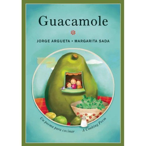

“Guacamole” is a recipe poem written by Salvadoran poet Jorge Argueta. It is the third book in Argueta’s bilingual cooking poem series. His first two books, titled “Sopa de frijoles / Bean Soup”, and “Arroz con leche / Rice Pudding”, are structured similarly to “Guacamole. In all three, the poems’ verses span several pages, provide full text in both Spanish and English, and are accompanied by illustrations that enhance the text.

“Guacamole” is short, takes about seven to ten minutes to read aloud, and Mexican artist Margarita Sada’s accompanying oil-paint illustrations are as colorful and vibrant as the guacamole Argueta describes making. The illustrations are authentic in their depiction of the ingredients and materials needed throughout the poem, but use a much more round, cartoon feel when depicting everything else. By giving the family depicted a generic, light olive skin tone and brown hair, illustrator Sada remains true to the Spanish heritage that traditionally makes guacamole, while still making the book accessible to a wide variety of children reading and looking to see themselves in the illustrations:
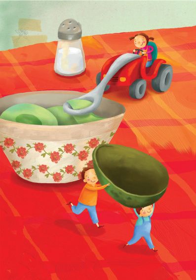


One of the things I love about this book is that the title is the same in English and in Spanish: Guacamole. Thus, despite the poem being presented in two different languages, the finished product is one with which native speakers of either language can relate. Cooking is such a social part of families and culture that the idea of making food to bring one’s family together is one with which nearly all readers can identify. One of my favorite lines in "Guacamole" is when Argueta encourages this social aspect of cooking and tells the reader/cook to sing and dance as they taste, "because food tastes better / when you sing and dance." (Guacamole)

Because the poem is presented as a recipe rather than a more traditional story, there is a great deal of room for the reader to insert his or her own experience with cooking between the lines of the poem, and particularly of making guacamole. This can spark great discussion about why we cook for our families, who does the cooking, what ingredients we use, etc.

The language in “Guacamole” is, as one might expect, wonderfully poetic. Argueta describes the his ingredients in vivid language that really gets the reader hungry! For example:

“Sing to the salt
as you shake it
so that little spatters
of white drizzle
fall like rain on the green avocado.”
- "Guacamole"

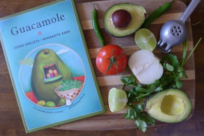
The bottom line is that I suggest a visit to the grocery store before reading "Guacamole". The best way to read this book is like this:

Friday, July 25, 2014

BLACK ELK'S VISION: A Lakota Story, by S.D. Nelson

Quick Facts:
- 56 pages
- Illustrated by author, S.D. Nelson


"Black Elk's Vision: A Lakota Story" is a narrative biography of the life of Black Elk, a Lakota Sioux leader who lived from 1863-1950. Black Elk witnessed and survived the forced relocation of his people, and became well-known to the American public upon the 1932 release of Black Elk Speaks: being the life story of a holy man of the Oglala Sioux, by John Neihardt. 
S.D. Nelson, who authored and illustrated "Black Elk's Vision: A Lakota Story", is a well-respected Lakota Sioux artist and writer. He describes Black Elk's vision (which becomes a metaphor for the man's life) as, "uniquely Native American, filled with images of painted horses, rabbits, deer and rumbling Thunder Beings." However, Nelson then counters this with an observation into how, "what he witnesses speaks to something fundamental in the human experience- the universal quest to connect with the all-encompassing force that is the Great Mystery."

Thus this is a story told by a voice authentic to its topic, and which strives to be at once distinctly Native American and also universal in the applicability of the questions it asks. I believe it succeeds.

Nelson's illustrations are done with careful attention to traditional Lakota Sioux artwork. Compare the following artwork:

Traditional Lakota Sioux pictorial muslin.
Illustration from "Black Elk's Vision: A Lakota Story", by S.D. Nelson

Notice how Nelson draws on the same colors used in the traditional art: reds, blues, browns and goldens. He draws the horses long, legs outstretched, with warriors on their backs at near ninety-degree angles. The background of the image is the same light, brownish-tan it would be if it were on muslin or animal hide.

And yet, Nelson also brings a more intimate, and more contemporary feel to his illustration. The images are larger, and closer together, so that much less of the canvas is visible. The colors are brighter, more vibrant, and he adds detail that adds visual interest (like the painting of the horses). All of these contribute to making Nelson's heritage more accessible to the reader.

Additionally,  Nelson makes the decision to spell Lakota words phonetically. For example, the Lakota word "Wasichu" ("White Man") is spelled through out the book "Wha-shi-choo". Clarifying the three-syllable pronunciation in this way makes the word one that native English readers can say with confidence, and minimizes the cultural distance created when readers encounter language they are not sure how to navigate. 

Though Nelson created a great deal of artwork for this book, he made an excellent decision to include alongside his art photos of the times and of the people discussed in the book. This not only serves to remind the reader that despite the narrative form of the text and the gorgeous illustrations, the events Black Elk recounts were very real and had terrible repercussions. 

In terms of reader age, I believe this book is most appropriate for upper elementary and middle school, because of the themes addressed and the complexity of the writing, Younger students simply don't have the background knowledge or experience for the significance of events like Little Bighorn to register, or for the connection between Black Elk's vision and reality to resonate. Though the text is straightforward, with few tricky grammatical structures, there is a lot of it and it is dense with information:


"Black Elk's Vision: A Lakota Story" is a beautiful book that brings alive the experience of the Lakota Sioux at the turn of the century. Too, it is a Native American story told by an authentic Native American voice, and so is all the more valuable for its perspective.

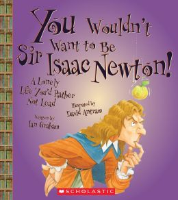
YOU WOULDN'T WANT TO BE SIR ISAAC NEWTON!: A Lonely Life You'd Rather Not Lead, by Ian Graham

Quick Facts:
- illustrated by David Antram
- part of series (You Wouldn't Want to Be . . .)
- 32 pages

"You Wouldn't Want to Be Sir Isaac Newton!: A Lonely Life You'd Rather Not Lead" is part of a series of informational books for children, all of which utilize the device (and titular structure): You Wouldn't Want to Be . . . 

Overall, this is a fun, informational book with a structure entertaining and accessible to children. Simple sentence structure, amusing illustrations, and careful page layout make it developmentally a very appropriate text for mid to upper-elementary students. It includes a table of contents, glossary and index, which makes more easily navigable.

The illustrations lend a great deal of humor and accessibility to the test, while also supporting the information presented in the text:


Though the cartoon is funny, it also reflects the information immediately preceding it: that Isaac Newton's father died before his birth and so he had only his mother, and that he was raised in a manor house. The layout of multiple picture with accompanying text keeps the reader engaged while also moving the story along chronologically:


You'll note that the events depicted move chronologically from top to bottom, through the early years of Isaac Newton's childhood. 

I do, however, have one major reservation about this book. The "You Wouldn't Want to Be . . . " series covers everything from more general subjects (like "You Wouldn't Want to Be A Pirate's Prisoner: Horrible Things You'd Rather Not Know") to specific biographies, like this one on Isaac Newton. The signature device of the series is that they directly address the reader to inform on the lesser-known, often grosser and more outrageous facts of a given topic. This works very well for subjects like pirates, where the "gross-out" factor is actually kind of fascinating, and makes the book a funnier read. With biographies, however, this device words less well.

In this biography of Isaac Newton, the outrageous facts highlighted are things like the personal tragedy of his upbringing (no father, and a mother that abandoned him at a young age) and his individual demons (like battling depression). These do not have a humorous effect, though they certainly support the titular statement. Consider the following:

"YOU ARE a remarkable person, but you have trouble getting along with other people. your obsessions quarrels, and secrets make you lonely and unhappy."
- "You Wouldn't Want to Be Sir Isaac Newton!: A Lonely Life You'd Rather Not Lead", page 5

I take issue with information presented like this. It's one thing to present factually the ups and downs of Newton's life. It's another to spend the book reinforcing the title: "A Lonely Life You'd Rather Not Lead". This suggest that the hardships and lows in Newton's life were not worth the successes. This is a very dangerous message to send to children, who are the book's target audience. Greatness in any field requires hard work and sacrifice, but that does not mean that we should not strive for it.

Wednesday, July 23, 2014

DARK EMPEROR & OTHER POEMS OF THE NIGHT, by Joyce Sidman

Quick Facts:
- illustrated by Rick Allen
- poetry
- collection
- Newbery Honor Book

"Dark Emperor & Other Poems of the Night" is a collection of poems linked by the theme of what happens in nature after the sun goes down. The poems are organized in a natural progression, beginning (appropriately) with "Welcome to the Night" and ending with "Moon's Lament", which reflects the moons feelings about the coming dawn.

Despite their strong thematic link, each poem is distinct and self-contained enough to be enjoyed on its own. The effect of this is that the poems complement one another, rather than relying on one another. You can enjoy "Night-Spider's Advice", for example, completely on it's own. But you see it in a different light once you've read "Cricket Speaks", simply for the way in which you can imagine these two perspectives might be at sometimes fatal odds.

One of the most interesting choices author Joyce Sidman makes is to include an informational blurb with each poem, printed on the page opposite the poem. This information actually serves to support and deepen the reader's understanding of the poem, while also providing a teaching moment about nature. For example, on page 8 the poem "Snail at Moonrise" refers to a snail as "shell-maker". The informational blurb on page 9 then elaborates on this, telling the reader that young snails produce a special material that helps them add layers to their shells as they grow. By focusing the informational blurb to what is relevant to the poem, Sidman not only provides support for understanding her poems, but encourages the reader to be active in their reading of her poetry.

"Dark Emperor & Other Poems of the Night" contains many different poetry styles, each poem playing with rhyme, rhythm and sounds in different ways. For example, consider this portion of one of my favorite poems, "Ballad of the Wandering Eft":

"Come all you young efts,
so brave and so bold,
and don the bright colors
of scarlet and gold.

Step out from your puddles
to breathe the sweet air
and wander the woodlands
with hardly a care.

     For it's wild and it's windy
    way out in the woods,
    where the moss grows like candy
    and the hunting is good,
    where the rain falls from heaven
       and mud's underfoot
    It's wild and it's windy
    way out in the woods.
- "Dark Emperor & Other Poems of the Night", page 24

As is typical with ballads, it has a repeating verse (the italicized one), and uses consistent syllable patterns and rhyme to create a rhythmic flow to the poem. The poem is structured symmetrically: verse, verse, chorus, verse, verse, chorus.

Now consider "Dark Emperor". Along with having no rhyming pattern or syllabic consistency, "Dark Emperor" plays with words in a wholly different way:


The poem looks like an owl! The final verse, which references a "tiny hiccup" when considering the owl's predatory prowess looks (in contrast and placement) like a small animal about to become the owl's prey. This diversity in poetic style and structure makes "Dark Emperor & Other Poems of the Night" an excellent introduction for students to the variety of forms poetry assumes.

Finally, Rick Allen's woodcut illustrations are appropriate and support the poems not only by highlighting both the grit and beauty of nature, but by using the play of darkness against light in a way suggestive of the moon glinting through leaves:


These images support the sense that the poems give the reader of glimpsing into a familiar and yet unknown world, the effect of the woodcut style and the play with light rendering familiar images more complex then we are used to seeing them.

Friday, July 18, 2014

GOOD BOOKS, GOOD TIMES!, compiled by Lee Bennett Hopkins

Quick Facts:
- illustrated by Harvey Stevenson
- poetry collection
- 32 pages
- contributing poets include: Karla Kuskin, Jack Prelutsky, Arnold Lobel, and more


Good Books, Good Times! is an anthology of poems collected specifically for their focus on books and reading. There are fourteen poems in all, and each poem is given a full, two-page spread for both the poem and its accompanying illustration. The effect of this is that the reader is truly able to focus on and get lost in each poem, without any distraction from the accompanying page. I love Shel Silverstein's Where the Sidewalk Ends, but I remember as a child rushing through certain poems because the illustration on the opposite page made its poem look so much more interesting. Good Books, Good Times! therefore does an effective job of allowing each poem to really be appreciated on its own.

One thing that impressed me about this anthology was the variety of poetry styles that are represented. Despite having only fourteen poems, the collection includes everything from free verse to familiar rhyming patterns to poems with only two words in each line. This makes it a wonderful introduction to poetry for children who may have the idea that poetry has to rhyme, or is always bound by specific syllable patterns. I love imagining students' faces after having this poem read to them:

AN HISTORIC MOMENT
by William J. Harris

The man said,
after inventing poetry,
"WOW!"
and did a full somersault.
- Good Books, Good Times!

Harvey Stevenson's illustrations to a wonderful job reflecting the poems they accompany in ways that often bring even more humor to the poem, and can help new readers of poetry begin to understand how you read and take meaning from poems. For example, look at the illustration that accompanies "An Historic Moment" from above:


There are many ways this could have been illustrated that would have shown the events of the poem. For example, Stevenson could have chose to divide the story in to separate frames, telling each moment (inventing poetry, WOW!, and the somersault) individually. However, that would not have been a true reflection of the poetry style Harris uses here. The poem is short, abrubt, unexpected. The entire poem, is in effect, a single moment- the moment that the man invented poetry. Thus, Stevenson's choice to show only that moment of movement into a somersault is completely appropriate. Too, it's funnier!

Which raises another point about the poems in this book- they are fun to read. Below is the first verse one of my favorites, by Isabel Joshlin Glaser and titled "What If . . .":

What if . . .
   You opened a book
   About dinosaurs
And one stumbled out
And another and another
   And more and more pour
Until the whole place
Is bumbling and rumbling
And groaning and moaning
   And snoring and roaring
And dinosauring?

Not only does it address a very real, rather wishful thought many of us have about our books (even in our twenties!) but it's fun to read, particularly aloud. "Bumbling and rumbling" and "snoring and roaring and dinosauring" are just silly and fun to say. This is important because the theme of the collection is the joy of reading. If it were full of poems that discussed the joy of reading without bringing any joy to their own reading, the collection would have fallen a bit flat.

Good Books, Good Times! is an excellent introduction to several different types of poetry, and to a variety of poets who whose work is truly fun to read. The illustrations lend humor while also providing support for interpretation of each poem. Overall, it is an excellent read-aloud choice for young readers of all ages, but is a particularly good starting point for independent readers beginning to grasp the concept of rhythm and rhyme.

Thursday, July 17, 2014

THE BEST BOOK OF BUGS, by Claire Llewellyn

Quick Facts:
- 32 pages
- nonfiction

The Best Book of Bugs is a bold title for author (and illustrator?*) Claire Llewellyn to have chosen, especially since there are an abundance of picture books about bugs for children. However, while I lack the bug-book background for wide comparison, I can confirm that this is a truly excellent book about bugs, describing the habits, habitats and life cycles of a variety of insects.

Information about bugs aside, perhaps one of the best things that The Best Book of Bugs does is help develop a young reader's pragmatic awareness of how traditional informational texts are arranged. The book begins with a table of contents where the reader can determine the location of each topic discussed in the book. This table of contents includes illustrations to accompany the text, so that even emerging readers can determine (for example) that bees are discussed on pages 12 and 14:


The pages are numbered along their bottom outside corner, and each section is labeled (in font larger and bolder than that found on the rest of the page) identically to the way it was named in the table of contents. Pages 32-33 at the very end of the book contain a glossary of terms used throughout the book. That said, glossary terms are not bolded throughout the book, which means that in terms of full functionality as an information text, The Best Book of Bugs is better suited to readers with a bit of familiarity already with how a glossary works.

In terms of the information and page-layout, The Best Book of Bugs does not waste any space, while still maintaining readability and flow. Consider the following page:


There is a lot going on here, but it is carefully organized. Each bug shown is clearly labeled, with lines connecting label information to specific parts of the bug. For the two illustrations which have a more substantial amount of text accompanying them (the central, cross-page stream and the Damselfly Nymph), a small triangular bullet precedes the text, pointing in the direction of its accompanying illustration. Bookending the central information are panels showing information on two clearly labeled topics. Along the far left edge, moving down the page, are outlined the steps a dragonfly nymph follows to catch a meal. Along the far right edge, moving down the page, are three examples of how different water bugs obtain oxygen. This structure allows a great deal of information to be shared in a way that is simple for the reader to navigate and digest.

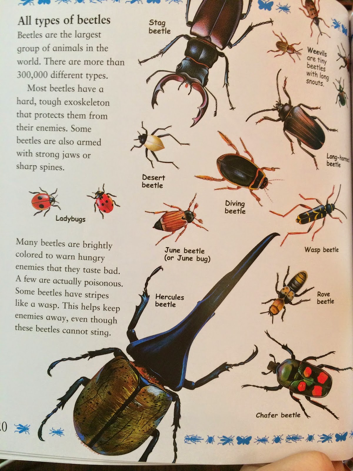
The illustrations accompanying the text in this book are wholly realistic, which is appropriate both for an informational text and also for the detail with which the text at times discusses its subject matter. Take, for example, the following section on the "stag beetle":


A more impressionistic illustration, focusing primarily on shape and color (like those in Planting a Rainbow) would not permit the reader to see the way in which the stag beetle's jaws look like "horns or antlers." What's more, it would provide little basis of comparison for the reader to distinguish the differences between the different types of beetles shown later:


Overall, The Best Book of Bugs is a very informative, easily navigated book about bugs for young readers. Because of the size of it's type (average is about size 12 font), the scientific language used ("nymph", "oxygen", etc.), and the lack of bolded glossary words, I would recommend it for ages 8+. 

Also, for readers interested in bugs. You have to really like bugs.

*This seems implied by the bibliographic information, but is not explicitly stated. 

PLANTING A RAINBOW, by Lois Ehlert

Quick Facts:
- picturebook
- 40 pages
- Written and Illustrated by Lois Ehlert

This book is an excellent introduction for young children to the process and steps involved in growing a garden, as well as to a variety of colorful plant species. The story is simple, and established in the very first line:

"Every year Mom and I plant a rainbow"
- Planting a Rainbow, page 1

Note that the colors used in the text for "rainbow" are the colors of the rainbow, in backwards order than children will later learn them in school (ROY G BIV, anyone?) This simple and yet careful attention to detail is characteristic of the book as a whole.

Both the language and illustrations Ehlert uses are developmentally appropriate for beginning readers and young children (not always the same thing!) Though she uses vocabulary specific to her topic of gardening (e.g. bulb, seedlings, sprout, soil), her sentence structure remains very basic:

"In the fall we buy some bulbs and plant them in the ground."
- Planting a Rainbow, page 2-3

You'll notice that in both quotes I've used, I've made the text larger. This is to reflect Ehlert's use of large, easy-to-read font, which not only lends itself to the aesthetic of the book, but makes it easier for little hands to point as they read.

Her accompanying illustrations reflect the accurate and yet easy-to-read nature of her prose. Rather than including incredibly detailed pictures of the plants she describes, Ehlert elects to show instead the general impression the flower (or bulb) makes, focusing on shape and color as her means of communicating this. For example, observe the five different bulbs and flowers shown in the illustration below:


Each bulb and flower is unique, reflecting through shape and color the overall effect of the flower. Furthermore, each labeled species is accurately depicted, distinct from the ones surrounding it. Compare, for example, the below images of a daffodil and its bulbs to the center illustration of a daffodil above.

Daffodil (Narcissus)
Daffodil (Narcissus) Bulbs

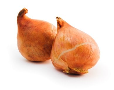
Ehlert has depicted daffodils accurately in shape and color, down to the darker yellow/orange center and the bulbs that are larger, and grayish in contrast to the red/orange of a tulip bulb and the purple of a hyacinth bulb (see the below image of tulip and hyacinth bulbs for proof of this contrast).
Tulip Bulbs

Hyacinth Bulbs
Childrens' ability to perceive the details that distinguish objects develops as they grow older. A very young child, for example, might perceive only that these are all flowers because they have basic characteristics the child associates with flowers: growing out of the ground, a stem, a colorful head. Thus, Ehlert's focus on the overall effect of the flower, rather than on more realistic detail, is appropriate for very young readers who are still develop their ability to classify objects. Though they are both flowers, Ehlert's illustrations make it easy to tell (for example) that the daffodil is differs from the tulip in color and shape, both of which are characteristics children can use for object classification early in their development.

On the topic of color, Ehlert ends her book with a call back to the rainbow of the very first page. Once the flowers have all bloomed, she takes her readers through each of the species, organized by color, and in order of the light spectrum:


Each color marks the edge of a page, which is identical to the one showing in structure. The flowers shown on each page reflect the color shown on the right side of the page. This not only aids children in developing their color classification, but subtly reinforces the spectrum colors, and the order in which they appear.

Planting a Rainbow is a beautiful and informational book for readers of all ages, but it is designed to be particularly appropriate for the development of very young children and readers.

THE BIRD ALPHABET BOOK, by Jerry Pallotta and Edgar Stewart

Quick Facts:
- Illustrated by Edgar Stewart
- alphabet picture book
- 32 pages


The Bird Alphabet Book, written by Jerry Pallotta and illustrated by Edgar Stewart, is a beautifully illustrated alphabet book that introduces the reader to twenty-six different species of bird (plus one bonus mammal!) The book does a lovely job of presenting specific information about each of the species that is likely to engage young readers, and which anticipates their questions about each bird.

Consider, for example, the following page for "T":


As an informational book, Pallotta is bound to provide factual information on the birds he chooses to represent each letter. However, it is clear that he put a good deal of thought not only into which birds would be the most visually interesting for young readers, but which ones were likely to inspire childrens' questions. By choosing a toucan to represent the letter "T", Pallotta not only selected a bird that is unique and interesting to the eye, but that looks a little goofy. You can imagine a child giggling and pointing to the long orange beak, asking, "But why the beak so long?"

This is where the collaboration between author and illustrator becomes clear. Rather than explain that the toucan's beak helps it reach food deep inside tree holes, Pallotta allows this information to be shown by Stewart's illustration. This leaves Pallotta free to address the next likely question: but isn't the beak heavy? One of the frustrating aspects of informational books for both parents and children can be when the book doesn't have information to answer the questions children have. Though The Bird Alphabet Book certainly doesn't answer all questions, it does endeavor to anticipate and respond to as many of them as possible.

Perhaps one of the best moments of anticipating the readers' questions occurs at the very beginning of the book, with the letter "B":

The text here reads:

"B is for Bat. Hey, wait a second! Bats are not birds. Bats are mammals Even though they have wings and they can fly, they do not have feathers. Get out of this book, you Bats!

Now that the Bats are gone, let's find a bird whose name begins with the letter B."
-The Bird Alphabet Book, page 2-3

Bats, by virtue of the place they hold in popular culture as a symbol of the night (and also the way their name rhymes with "cat" and "mat" and "sat"!), are some of the first animals with which children often become aware- even if they've never seen one in real life! The bird that Pallotta chooses for "B" is the blue-footed booby. Without the page shown above, it is easy to imagine a child turning to their parent and asking, "But what about bats? Bats start with B. Why no bats?" And quite frankly, most parents would probably have to Wikipedia to determine why a bat would not be included in a bird alphabet book for children (I would have!)

Thus, Pallotta addresses the question head on, using a full, two-page spread to do so. By not placing the bat on a single page next to a bird, Pallotta sets bats apart from the birds he discusses. Each of the birds gets only one page, and so this section about the bat actually interrupts the flow of the book. All of this contributes to the main point Pallotta is making about bats: that they are NOT BIRDS. 

Like Pallotta, Stewart had an obligation to depict each species as accurately as possible, and his gorgeous watercolors are successful in this. However, frequently uses the animals' eyes to show expression and personality that make the illustrations more engaging than they might be otherwise. Look particularly at the eyes of the crocodile below (included on the page for Crocodile Bird):


He looks like he's laughing! Another excellent example is the White-faced Scops Owl page, in which the owls' eyes make them look very stern:


These images remain accurate to the animals' actual appearance, but lend life to the watercolors.

Perhaps my only reservation about this book is that there is very little that is lyrical or funny about the prose (much less both). Which is not to say that all books for children must be written lyrically or be crammed full of laughs! However, I think that an alphabet book is an obvious place to use lyrical language, particularly since children learn their alphabet in the form of a song. In terms of the humor, it is present in a few places (like the "Bat" page) but is not consistent in its usage. This, at times, made the writing feel a bit too dry for me, despite the wonderful job Pallotta did in selecting the information he presented for each species. I think that this, as well as the overall flow of the book, could have been improved had either the language bit more lyrical or the humor more consistently employed.

Overall, this a book best suited for readers 2nd-3rd grade and older. Though younger readers will enjoy having it read too them, some of the species choices (such as "Indigo Bunting", "Blue-footed Booby) and "White-faced Scops Owl") are simply not appropriate linguistic challenges for beginning readers.

Tuesday, July 8, 2014

THE ROUGH-FACED GIRL, by Rafe Martin

Quick Facts:
- Illustrated by David Shannon
- 32 pages


Native American cultures are among those most frequently misrepresented in popular culture and literature, particularly in that targeted to young audiences. Too often, children's understanding of Native Americans is limited to the European-crafted tale of Thanksgiving and the high adventure and high stereotyping of cowboy/Indian tales.

The Rough Faced Girl, by Rafe Martin, is unique in its respectful and authentic retelling of an Algonquin "Cinderella" story. Rather than using the familiar story structure to incorporate western European elements into the story, Martin stays true to the tale's Native American perspective- even when that leads to narrative choices that have the potential to confuse conventional western-European audiences.

One of the most fascinating aspects of The Rough Faced Girl is the "prince" figure, here known as the Invisible Being. In most traditional versions of Cinderella, the prince is little more than a symbol of power, a reward that Cinderella receives for being pious/generous/gracious/etc. The Invisible Being of this tale, however, is more nuanced. He lives with his sister, who speaks with all the women who wish to marry her brother. Her questions suggest something very interesting about the Invisible Being: that the only woman who will be able to see him is the one who knows already what he looks like.

This seems contradictory, for how could any woman know what he looks like if he is invisible? The answer, of course, is revealed during the titular Rough Faced Girl's conversation with the Invisible Being's sister. Though I will not spoil it, I will say that it is grounded in Native American respect for and understanding of humans' relationship with nature, and is thus in keeping with the cultural heritage of this particular "Cinderella" tale.

David Shannon's illustrations further reinforce both the cultural background of the story. Shannon uses muted, largely earth-tone colors suggestive of Native American art. The brightest illustrations come towards the end of the book, when he is depicting scenes of nature that have a distinctly spiritual, otherworldly cast to them. Reserving his brighter colors for these scenes emphasizes their importance to both the story and to the culture that produced it.


In terms of characterization, the Rough Faced Girl is at once a familiar and a progressive "Cinderella" figure. Like many of the heroines that populate similar stories, the Rough Faced Girl is kind, gentle, and virtuous. Her identification of the Invisible Being also suggests that she is more spiritually aware than the other women vying for his hand. However, unlike many of her counterparts, the Rough Faced Girl is the primary instrument of her own fate. There is no fairy godmother, or magic bird, or helpful crocodile that shows up with a means of her escape. Rather, after being told by her father that he has nothing left to give her, the Rough Faced Girl creates her own garments and goes on her own power to seek the Invisible Being and his sister.

Ultimately, it is the Rough Faced Girl's own understanding of the Invisible Being that wins her his hand, rather than her beauty or an intriguing glass slipper.


GLASS SLIPPER, GOLD SANDAL: A Worldwide Cinderella, by Paul Fleischman

Quick Facts:
- Illustrated by Julie Paschkis
- 28 pages

Glass Slipper, Gold Sandal is a cleverly conceived and gorgeously realized patchwork of various elements found in the Cinderella stories told all over the world. While it is not the most satisfying stand-alone Cinderella tale I've read, it does an excellent job bringing diverse versions of the tale together in to a coherent whole that, ultimately, leaves the reader wanting to know more about the stories from which each individual piece was sourced.

One of the greatest challenges of this book comes from its aim to not only bring together many versions of the same story but to simultaneously highlight the culture of each contribution. After all, flagging the text of each section with its country of origin (Russia! Iran! India!) would be distracting and interrupt the flow of the story. It would detract from that message that despite the variances, the story remains structurally same.

Author Paul Fleischman and illustrator Julie Paschkis meet this challenge through coordination of the text layout and the accompanying illustrations.


Notice how Fleischman separated the text by its country of origin, and then how Paschkis framed each chunk of text with artwork representative of that country. Though the country of origin for each section is clearly identified, it is identified in the illustration and done in the same colors as the illustration. The effect of this is to allow the text and primary illustrations (such as the Cinderella in a kimono) to draw the reader's initial attention and focus. Thus, the story maintains its flow as a single, cohesive tale. However, the segmenting emphasizes the way in which different aspects of the tale were drawn from different sources, with those sources visually and textually represented for those who care to examine closer the story's diversity.

Paschkis' folk-art style also contributes to the cohesiveness of the story as a whole. Though contributing countries are made distinct both with color and with the presentation of people and setting within each scene (see the distinctly Chinese style of the fish in the red section, in comparison to the purple Indonesian crocodile), they are also bound by the folk art style. This suggests, again, that though each culture has its own way of telling the story of Cinderella, they are all ultimately telling the same story.

One aspect of this book I found particularly interesting was the decision to bookend the Cinderella story with images of a woman reading Glass Slipper, Gold Sandal to a little girl. Narratively, this underscores the oral tradition of the story across cultures, and the way it has been passed down through generations. However, Paschkis' decision to depict the woman and girl as different ethnicities is clearly a conscious one. I say woman and girl, rather than mother and daughter, because I think the relationship between these two figures is deliberately ambiguous.


The most obvious interpretation is, of course, that it is a mother reading to her daughter. In this context, the image reflects a multi-cultural family. However, I think it is more powerful to consider the woman as simply representative of an older generation, and the girl representative of the younger one. They are of different ethnicities because, actually, their ethnicity doesn't matter any more than does their relationship. The message of the book is that these tales have been passed for hundreds of years from one generation of another, through the sharing of stories. This image, as well as the similar one at the book's opening, reflects this.


CINDER EDNA, by Ellen Jackson

Quick Facts:
- Illustrated by Kevin O'Malley
- 29 pages

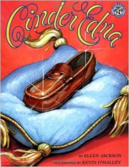
There is nothing subtle about the moral of Cinder Edna, which retells the familiar story of Cinderella in a near-modern setting with two impoverished protagonists instead of just one. In the story, the tale of Cinder Ella is told parallel to that of her neighbor's, Cinder Edna, who has a similar home life to Cinder Ella but deals with it in very different ways.

I'm not a huge fan of books with as overt a feminist message (or really any political message) as Cinder Edna presents. I find that in such cases the story often is sacrificed for the message, and (for me) that takes a great deal out of the magic of storytelling.

Cinder Edna has some inspired moments. However, all of these occur the story of Cinder Edna herself; the tone of Cinder Ella's story, as depicted here, is full of sarcastic comments and asides that verge on disparaging. In a story about embracing who you are, this really rubbed me the wrong way.

To demonstrate what I mean, take the following lines from the Cinder Ella storyline:

"Meanwhile, Cinder Ella's big, bright eyes filled with tears. "But, Fairy Godmother, how will I get to the ball?"

The fairy godmother was surprised that her goddaughter couldn't seem to figure anything out for herself.
- Cinder Edna, page 9

To contrast this, and to underscore Cinder Ella's utter incompetence and dependence on others, Cinder Edna is shown taking the city bus.

Now I love the idea of a Cinderella character taking control of her fate, and Cinder Edna's bus ride (during which she is shown reading to children) is a fantastic spin on the story. In fact, all of Cinder Edna's exploits are fantastic spins on the classic tale. She's cheerful and hardworking! She plays the accordion! She's not the prettiest girl around, but what does that matter anyway? She's "strong and spunky and knew some good jokes"! (Cinder Edna, page 6)

Cinder Edna's prince is similarly delightful. He's short and bespectacled and runs a recycling plant and home for orphaned kittens. His name is Rupert. Naturally, he and Cinder Edna share many interests in common, get along famously, and are set up for one of the most believable "happily ever afters" to be found in a fairy tale. The colors used to tell the story of Cinder Edna and Rupert are bright and bold and cheerful, matching the characters perfectly.


However, I find there is much to be desired in the message sent by both the writing and the illustrations of Cinder Ella's story. As the quote above demonstrates, Ellen Jackson apparently felt that in order to tell the story of spunky Cinder Edna, she needed to contrast it with a more traditional telling. So she includes Cinder Ella, who is consistently shown as whiny, incompetent, lazy, and superficial. Cinder Ella is beautiful, and that is the only thing that gets her anywhere. This, as well as the other listed traits, is captured perfectly in the following illustration (which is a small section of the larger illustration of Cinder Ella's wedding):


She's not even looking at her groom and is in the process of putting on lipstick! Furthermore, the text of Cinder Edna's story constantly takes jabs at Cinder Ella:

"Edna had tried sitting in the cinders a few times. But it seemed like a silly way to spend time."
- Cinder Edna, page 5

Additionally, consider the illustrations that accompany the text about how the two girls made it to the ball:


Cinder Ella is dolled up like a southern beauty pageant contestant, either tripping over or gasping in horror at the mice surrounding her. Either way, her fairy godmother in the background is thoroughly unamused. Cinder Edna, however, is shown dressed simply, and smiling as she reads a book called "Woofers and Tweeters" to a black child on the city bus.

Look! these pictures say. Cinder Ella is whiny and stupid and annoying and stuck in conventional gender roles, while Cinder Edna is fun and happy and capable! Cinder Ella squeals at a few mice, but Cinder Edna has no problem riding the public bus and striking up conversations with people of diverse backgrounds. Also she reads.

Again, my issue is not with Cinder Edna's story, but with the way in which the book mocks Cinder Ella in contrast. I'm sure the author intended the book's overall message to about women embracing their own abilities and staying true to themselves. However, the message that comes across is that women should embrace their own abilities and stay true to themselves as long as they are Cinder Edna. If you are pretty, or like pretty things, or aren't sure how to handle a situation, or ask for help- well, then you're pathetic and we are going to mock you. Oh, and you're destined for marriage with a vain idiot who won't actually care about you.

This is not a productive message to send our girls. Though I'm all for more Cinder Edna characters, who take care of themselves and are fine with taking a city bus to a ball, I do not think it's necessary or helpful to throw the Cinder Ellas of the world under that same bus in the process.

Friday, July 4, 2014

THE OLD WOMAN WHO NAMED THINGS, by Cynthia Rylant

Quick Facts:
- Illustrated by Kathryn Brown
- 29 pages

Heads up, this book made me cry.

Not the gasping, choking crying of a sudden overload of emotion, but the silent, steady stream of tears that comes after a slow, deliberate build of well-placed emotional triggers.

The Old Woman Who Named Things (Old Woman), by Cynthia Rylant, tells a story of an old woman determined to call by name only those things that will outlive her, in order to avoid losing any more friends. The imagery and characterization of inanimate objects will entertain children, while the motivation behind such characterization will resonate heavily with the adults reading with them.

When I consider what makes this book so effective for a wide range of readers, I cannot help but compare it to another of Rylant's books: An Angel for Solomon Singer (Angel for Solomon). Like Old Woman, Angel for Solomon centers around an elderly protagonist struggling with feelings of loneliness and fear. However, where Old Woman is a story that can be enjoyed by audiences of all ages, Angel for Solomon is likely to appeal primarily to an older audience. Though I believe upper middle school students could use it to explore literary analysis, I doubt many of them would appreciate or enjoy the story until they were much older.

The primary distinction Old Woman has from Angel for Solomon, I've concluded, is its humor. In Angel for Solomon, young readers cannot connect with Solomon's emotions and longings- they simply have not had enough life experience for it to resonate. Thus, while they can admire Peter Catalanotto's gorgeous artwork, there is little in the story for a young audience to truly grab onto and say "I get it!" Connection with a text is imperative for true appreciation, and in Old Woman, Rylant (and illustrator Kathryn Brown) provide this connection for their younger audiences through the humor of the main character.

Despite the origin of her naming ritual, Rylant presents the old woman's predilection with naming inanimate objects in a matter-of-fact and humorous manner:

"Once there was an old woman who loved to name things.
She named the old car she drove "Betsy."
She named the old chair she sat in "Fred."
She named the old bed she slept on "Roxanne."
And she named her old house "Franklin."
The Old Woman Who Named Things, page 2

Note that Rylant says the old woman "loved" naming things. This positive association with her character defining trait immediately presents the character in a happy context. Regardless of what will later be revealed has her reasons for naming things, Rylant makes clear up front that the old woman loves doing it, and makes her a character who evokes our empathy rather than our pity. This introduction is followed by some truly absurd naming. A car named Betsy? A chair named Fred? A house named FRANKLIN? I can just hear children giggling. Children love names; names are some of the very first words they learn, and children understand even at an early age that they have great importance. The idea of giving a human name to your furniture is a funny one, and I can imagine students going home after this read aloud and announcing to their parents that they are going to name their desk "Sally".

Brown's illustrations of the old woman and her things supports Rylant's characterization. The old woman is long and thin, with goofy hair that wraps up her head, and mis-matched clothes that are at once typically "old woman" and unique: for example, on the book's cover she wears a red cardigan and has glasses sliding down her nose, but on her feet are jazzy cowboy boots. She wears the boots in nearly every illustration, and they become visually as much a part of her character as the habit of naming things. Ultimately, the character that emerges is one who does not feel sorry for herself, and so as readers, we do not feel sorry for her either. Older readers (like yours truly!) may cry, but it is less for the old woman than it is for the way in which she makes us examine our own future. Younger readers will simply get caught up in the story of the old woman and the puppy.

Oh yes. There's a puppy. Still wondering why I cried? Without giving anything away, the old woman's interactions with the puppy and the absolutely adorable way in which Brown draws the puppy are further ways in which the story will engage young readers, while continuing to twist the hearts of the older ones.

It is notable that the titular "old woman" does not herself have a name. She is simply "the old woman", and I think that gives her a unique accessibility, particularly in a story populated by so many different names. She could be anyone's grandmother, mother, aunt or neighbor. Though the illustrations pin her down as a caucasian character, it would be interesting to read this story a group of people (children and/or adults) without the illustrations, and then ask them to draw their own portrait of the old woman. I would predict that people of all different backgrounds and heritages would draw portraits reflecting their own experience.

More than anything, this story highlights the power of names as a point of connection, and it is this theme which I believe will resonate with any reader, regardless of age.

POPPLETON: Book One, by Cynthia Rylant

Quick Facts:
- Illustrated by Mark Teague
- 3 stories: "Neighbors", "The Library", "The Pill"
- 53 pages
Poppleton, by Cynthia Rylant, is one of those books that was both less and more than I expected. Which is to say that it was a complete surprise, and a very pleasant one.

I've read some of Cynthia Rylant's work before, most notably The Old Woman Who Named Things, and so upon beginning Poppleton I was anticipating the lyrical, contemplative and sometimes almost melancholy prose I've experienced in her work. I could not have been further off if I tried.

The back cover of Poppleton states that, "The Poppleton books are an excellent way to help children learn to read," and the reason for this is evident in the very first lines of the story, "Neighbors":

"Poppleton used to be a city pig.
He did city things.
He took taxis.
He jogged in the park.
He went to museums."
- Poppleton, page 9

Like Dr. Seuss' Cat in the Hat and One Fish, Two Fish, Red Fish, Blue Fish, Poppleton uses very simple and basic vocabulary and grammatical structures that are easy for young readers to follow both orally and as they begin to read on their own. When I first realized this, I felt some trepidation, worried that perhaps the simplification of the prose would result in a simplification of the storytelling. I was not giving Rylant, or illustrator Mark Teague, nearly enough credit.

Poppleton is not one of the cookie-cutter characters that so often populate books aimed at teaching children to read. Rather, he is familiar in a far better way. Poppleton calls to mind Arnold Lobel's The Adventures of Frog and Toad, in that he is a character with a distinct point of view and unique perspective that explores basic, universal themes like friendship and individuality. Poppleton's appeal is the result not only of Rylant's deliberate characterization, but also of Teague's familiar and yet entertaining artwork.

Take, for example, the following two pages of dialogue:

"Then one day Poppleton
got tired of city life.
He moved to a small house
in a small town.

Poppleton's small house
was charming.
It had a little sunroom
where Poppleton took naps."
Poppleton, page 10-11

The idea of a pig named Poppleton is amusing enough already, and the alliteration of the "p" sound is sure to appeal to young listeners. However, the name Poppleton does even more within this text to characterize the pig: it dominates. Poppleton is by far the longest word used, and thus stands out in the text, particularly when read aloud, in a way that a name like "Jack" just wouldn't. It makes Poppleton sound not only a little funny, but a bit out of place and bumbling. Too, everything surrounding Poppleton is described as small: his house, his town, and his sunroom. Everything is charming, but small, and though Rylant does not say that these things are smaller than Poppleton, the image that forms is of a pig a bit out of place, a bit too big for his surroundings.

The effect of this, of course, could have been compromised had not Teague picked up on it when doing his illustrations. Fortunately, Teague's pictures of Poppleton reflect Rylant's characterization. As drawn by Teague, Poppleton is a tidy, almost fastidious pig calling to mind the stereotype of the portly English gentleman, and yet he is always a bit overlarge for his surroundings. Note in the illustration below the way in which Poppleton's sunroom is bright, and clean, and carefully maintained. Even the decision to have Poppleton resting on a chaise lounge rather than a sofa contributes to the characterization of Poppleton as a pig with a distinct point of view. And yet, Poppleton looks large next to all of his surroundings. He fits, but only just.

Poppleton's stories are familiar tales of dealing with friends and pursuing individual interests, and that gives them a universal applicability and appeal. However, Poppleton's own unique perspective makes the stories unique, and leaves even the reader familiar with similar stories wondering, "But what will Poppleton do?"

Poppleton is more than an "excellent way to help children learn to read." He's a character they are likely to carry with them into adulthood and call to mind (even if they don't realize why!) when they encounter in other stories a portly English gentleman.

JOURNEY, by Aaron Becker

Quick Facts:
- 2014 Caldecott Honor Book
- wordless picturebook
- 37 pages


Harold and the Purple Crayon, by Crockett Johnson, was always a magical and yet frustrating experience for me. Though my imagination was captured by the idea of a child creating an entirely new world using only a crayon, I desperately wished Harold would draw more. The sparse, purple and white of Harold's world was suggestive, but I wanted the dream fully realized, to explore with my eyes the tiny details of Harold's creations.

Though I didn't realize it when I opened the book, Journey is what I was looking for in Harold.

Journey's protagonist is a young girl with practically cropped hair and a profound loneliness. Her mother is busy cooking dinner when the girl wants to play outside; her father has too much work to fly a kite with her; her teenage sister is more interested in online connection than kicking around a ball with the girl. Furthermore, the city setting of the girl's home suggests that she can go no further than her own front stoop on her own.

From the very first illustration opposite the dedication page, author and illustrator Aaron Becker uses color not only to set the tone of the story but to represent his protagonist's imagination and desires. The girl's city home life he draws in shades of brown and gray, which serve not only to reflect the oppressive and bleak nature of the girl's daily reality, but to allow her ideas to stand out in stark contrast. In a succession of frames showing the girl approaching each member of her family, Becker uses the color red to make clear for the reader what his protagonist is seeking from each person (and thus also what she is subsequently denied). With her mother, she props a red scooter against the kitchen counter. She drags a red kite behind her while peering over her father's shoulder at the computer. She rests her arms and chin on a bright red ball as she sadly watches a sister more interested in a screen than in her.

Red is thus more than the color of the girl's various favorite activities. Red represents her longing for connection, for escape. Thus, when the reader spies a red crayon on the girl's bedroom floor, the red color makes it stand out instantly as something meaningful to the girl. My own history with Harold led me to suppose that the creative nature of a crayon could make it a means of escape, and in fact that is precisely what it proves to be. Using her crayon, the girl draws a door on her wall, through which she embarks on one of the most beautiful, and richly imagined adventures I've ever found in a book.

I will not detail here the course of her journey, as I think it would do future readers a disservice. Rather, I'll highlight a few things I found particularly effective and notable about the author's storytelling. As one might expect, the young girl's world explodes with color as soon as she passes through her constructed gateway. However, red consistently remains the color of the protagonist's imagination. It serves to continuously ground the story in the young girl's imagination, despite the intricacy of the world now surrounding her. For example, there is a two-page spread across which splays a magnificent castle, complete with a moat, domed ceilings, and rolling landscapes. It is easy at first to get lost studying the tiny details- Is that a windmill in the distance? Are those gondolas making their way across the castle walls? Everything is beautifully rendered, but it is rendered in shades of blue, green, and gold, so that the one detail that jumps from the page above all others is the girl's tiny red boat, approaching the castle from the bottom left corner of the illustration. This serves to remind us that everything unfolding before that tiny red boat is a product of the girl's vivid imagination, and re-establishes her as the focus of the story.

Like Harold, the girl in Journey often must think quickly to "draw" a new part of the adventure. However, unlike Harold, the girl's red crayon always draws a means of transportation. She draws a boat, a hot air balloon, a magic carpet- I would argue that even the initial door she drew was a means of transportation, as it was the gateway that allowed her into the imagined world and set her on her adventure. In this way, Becker suggests that imagination is more than a means of creating pretty images; it is a source of movement, of travel. Imagination, his images suggest, will move you forward just as surely as your feet.

Nearly halfway through the story, the girl encounters a new color that shapes and propels forward the remainder of her journey. I won't say more here, but I will note that the twist at the story's end makes me suspect Becker may have shared some of my reactions to Harold and his purple crayon.

Ultimately, Journey is a story of the places imagination can take us, and the connection those experiences have in shaping our daily reality.